Breaking Down The Good, The Bad, And The Okay Of The New Adidas NHL Jerseys


Adidas released all 31 home sweaters for the 2017-18 NHL season last night. Some of them are good, some of them are bad, and some of them are just okay. Quick heads up in case you haven’t been following, every team will only have a home and away jersey this year. It’s the first year Adidas is taking over jersey duty in the NHL over Reebok so they have 62 jerseys to make. Adding on a 3rd for at least half the league would have been too much right off the bat but I’m sure the alternates will start coming back in the 2018-19 season.
For the majority of the league, there really isn’t much change between last season’s jerseys and this year’s. The Original Six teams, Ottawa, Florida, Tampa, Pittsburgh, Washington, NYI, Philly, St. Louis, Dallas, Winnipeg, LA, Vancouver, Arizona, Anaheim and San Jose are all pretty much the exact jersey they wore last year. There’s some minor adjustments here and there but nothing that jumps out without taking a closer look. For some teams–like the Original Six teams–that’s a good thing. For other teams that needed a sweater overhaul–like Ottawa–that’s a bad thing. Anywho, let’s break these suckers down into “Good”, “Okay”, and “Bad” categories.
The Good
All The Original Six Teams
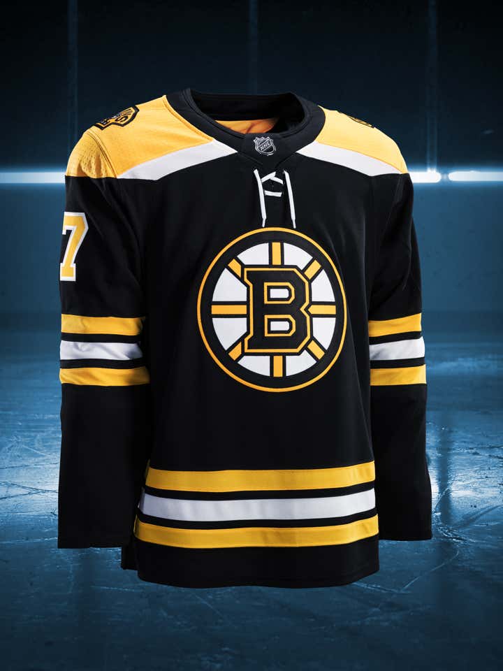


I feel like this was the biggest test for Adidas. Could they come into the NHL and just leave the most historic sweaters in the game alone? Or were they going to come in and try to stamp their dicks on the league and start turning the NHL into some European soccer looking pussies? I’m glad they opted for the former. Obviously the texture of the jerseys and the cuts are different. But the overall look of them are the same. Glad they had some self control there.
The Upgrades

What’s the easiest way to forget about having one of the worst seasons in NHL history? Going back to your roots and rocking the sweaters you used to wear when you were playing for the Stanley Cup every year. Colorado going back to their original look is huge for that franchise looking to turn around. You throw Landeskog and Duchene and MacKinnon in these bad boys and all of a sudden you trick yourself into thinking you’re watching Sakic and Forsberg and Hejduk again.

Similar idea with the Carolina Hurricanes. For the past 5 years or so, they’ve looked like a bunch of candy canes out there on the ice. They got rid of the flags on their jerseys and completely lost their identity. So they go back to the drawing board and come up with a new design on the look they had when they won the Cup. This is a desperation move for a team that could easily be shipped up to Quebec City if they don’t turn it around soon. The new uniforms are a good start.

I feel like the only people who don’t like New Jersey’s new jerseys are Devils fans themselves. I know the Devils have always had one of the better looks in the league. And I know that if they were going to change it up at all, people (me) were hoping they’d bring back the green. But this is a clean look that really isn’t much different than what they were working with before. They got rid of the big stripes on the bottom of the jersey but that just cluttered shit up. Plus, when the NHL finally starts throwing ads on jerseys, they’ll have all that open space to work with near the bottom.
The Okay
These are all just teams that didn’t really make any changes at all. And that’s okay because their uniforms were fine and didn’t need any adjustments for now.


Not much to say about these ones because like I mentioned, they’re the exact same thing as before. I know a lot of people weren’t initially fans of the Panthers’ new look and I get that. The logo looks like a soccer shield and they haven’t quite earned the thick stripe through the middle of the jersey. Would I like them to go back to their old look when they had Pavel Bure on the squad? Obviously. But they went to that look last season, I wasn’t expecting them to change again this year.
The Bad

Minnesota is bordering the line between “Bad” and “Okay”. Truth be told, I don’t actually hate this design at all. My only issue here is that Minnesota tries so hard to look like an Original Six team. They have the cream color instead of white. Now they have the thick bar going through the chest. I get that Minnesota is the State of Hockey. But the Wild didn’t come into the league until 2000. They’re over compensating with this look.

We’ve known Vegas was getting a team for over a year now. We’ve known they would be called the “Vegas Golden Knights” since November 23. All that time and this is all those mother fuckers came up with for their HOME jersey? Some fucking charcoal grey sweater? I don’t know. Maybe they’re not actually bad but they’re just extremely underwhelming. The one thing I do enjoy that I’m sure not a lot of people will agree with is that they’re going with white mitts.

White gloves for an Original Six team? Fuck outta here. White gloves for a team in Vegas? The entertainment capital of the world? Yes please.

The Oilers’ orange jersey wasn’t bad last year when it was their alternate. But I don’t think I’ll ever forgive them for ditching the blues this year. That sweater is such a major piece of hockey history and they pissed it away this year. Wayne Gretzky is rolling in his grave.

At least the Flames got rid of the piping with these jerseys but they still look like a high school team whose booster club couldn’t raise enough money for the jerseys they wanted. I think their issue is they keep trying to make black work with their look. Just go with red, white and yellow and you idiots will be set.

Like Calgary, Buffalo was at least able to get rid of the piping with these jerseys. But that’s just because of the actual Adidas jerseys themselves, not because Buffalo made the conscious decision to do anything about it. I don’t think I would necessarily hate these jerseys if they were to just get rid of the numbers on the chest. You can’t win a Stanley Cup with a look like that. Unless they get rid of those numbers in the next 2 seasons, look for Jack Eichel to be on the move soon.

Advertisement

This was the chance of a lifetime for the Washington Capitals. This was their golden opportunity to finally switch back to their vintage look full-time. And they dropped the ball. Only makes sense the same team that used a protection slot on Tom Wilson would fuck up a decision like this.

The Reebok Edge jerseys brought on some of the worst designs in hockey history. For the most part, every team that got a jersey overhaul when Reebok first took over has gone away from that look. Much like the Capitals, the Ottawa Senators–for some god forsaken reason–have stayed the same since 2007. Baffling.

Ladies and gentlemen. Presenting to you… the biggest loser of the year… the Nashville Predators!!!!
At this point, the Predators should have just gone with a completely yellow jersey. They’re just about there already with just enough blue thrown into the mix to make it look like Mike Fisher’s baby designed this shit. They may have won the Subban-for-Weber trade, but Shea has to be hype he doesn’t have to wear this atrocity next season.