It's Time To Rank All 30 NHL Uniforms

There have been quite a few changes and additions made to the hockey sweater world over the past couple of seasons. Some have been good and some have been bad. And while this is neither the first time nor the last time that someone has attempted to rank every uniform in the NHL, I think it’s very important that we do so now. Because next season, the entire league is going to undergo at least some level of change when Adidas takes over jersey duty in the NHL. I’m sure the majority of the change will be very subtle, but still a change nonetheless. So let’s take the time now to rank these jerseys as we know them.
Quick disclaimer: I’m a huge sucker for the Original 6 look and you should be too.
30. Anaheim Ducks
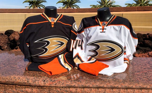
The Anaheim Ducks have had the worst jerseys in the league ever since Disney sold the team and they were no longer the Mighty Ducks of Anaheim. Since that time, they’ve managed to go from one of the best sweaters in the game to wearing what seems to be the equivalent of a puke sandwich. They even fucked up the easiest lay up in the world this summer when they unveiled their new third jersey with the Mighty Ducks logo on it. They could have just used the purple jersey from the 90s and it would have been a hit. Instead, they went with the same color scheme with Orange as the primary and it makes me want to punch a baby in anger.
29. Colorado Avalanche
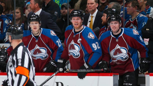
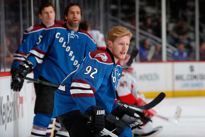
The Colorado Avalanche are one of the last teams remaining in the NHL who haven’t gotten rid of that ridiculous piping from the Edge template. It looks like shit, especially for guys wearing a letter on the front of their jersey. I don’t necessarily mind their third jersey as much but it would be nice if they had some sort of colorway on either their gloves and/or pants to go along with it. It’s no surprise that they haven’t won the Cup since Sakic and Forsberg were rocking those beauties from their time.
28. Dallas Stars
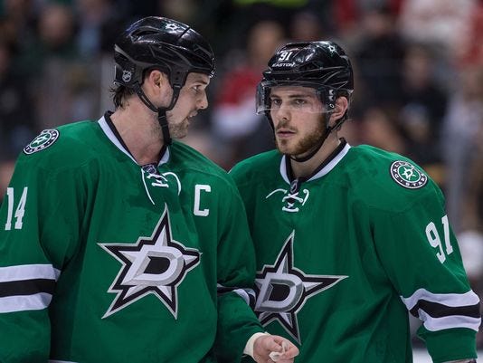
Similar to the Avalanche, very few teams got as fucked over by the Reebok Edge template as bad as the Dallas Stars did. The sweaters worn by Modano and Hull were fantastic, aside from the uterus jersey. But since going away from that design in 2007, they’ve worn nothing but shit. And the new look they brought to the table in 2013-14 has been the worst of them all.
27. Ottawa Senators
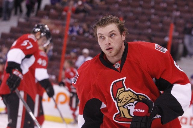
Incredibly boring. Don’t even want to talk about them anymore.
26. Columbus Blue Jackets
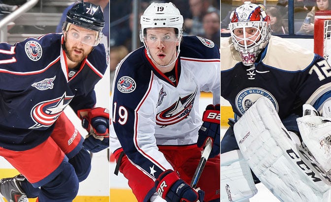
I also don’t even have much to say about the Blue Jacket’s set up. It’s just not a very good look. Like something that a college club team on a budget would come up with.
25. Nashville Predators
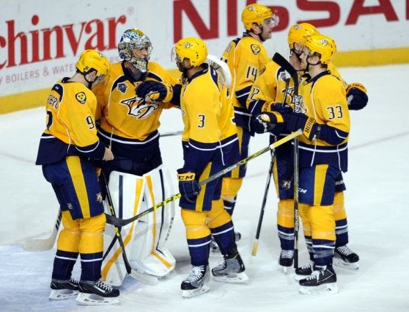
This year, the Predators will be wearing yellow helmets with their home jerseys for like 15 games or so. They should be relegated to the AHL for this move. Their uniforms are tough enough on the eyes as is, no need to pull this ridiculous stunt to make them even more hideous. With the blue helmets, maybe they move up a few spots or so. But they need to be punished for this yellow helmet nonsense.
24. San Jose Sharks
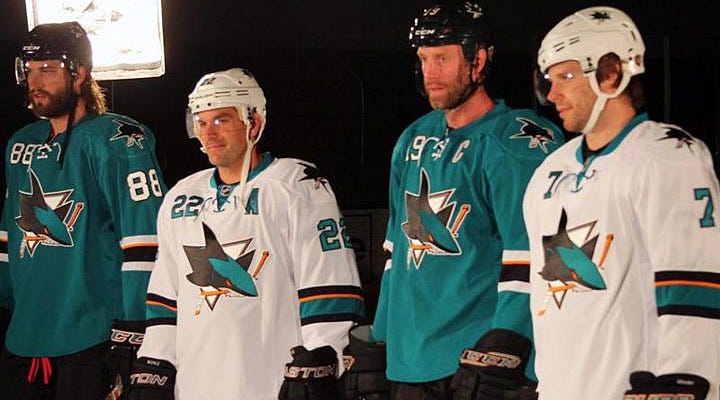
If you’ve been paying attention so far, there’s a pattern that teams from areas that aren’t typically considered to be hockey hotbeds tend to have some pretty awful uniforms. The numbers on the front of the jersey was a cool idea when they first started doing it in 2007, but not so much anymore. And nothing is worse than watching the Sharks play on the road. Those away jerseys midas whale just be practice jerseys.
23. Pittsburgh Penguins
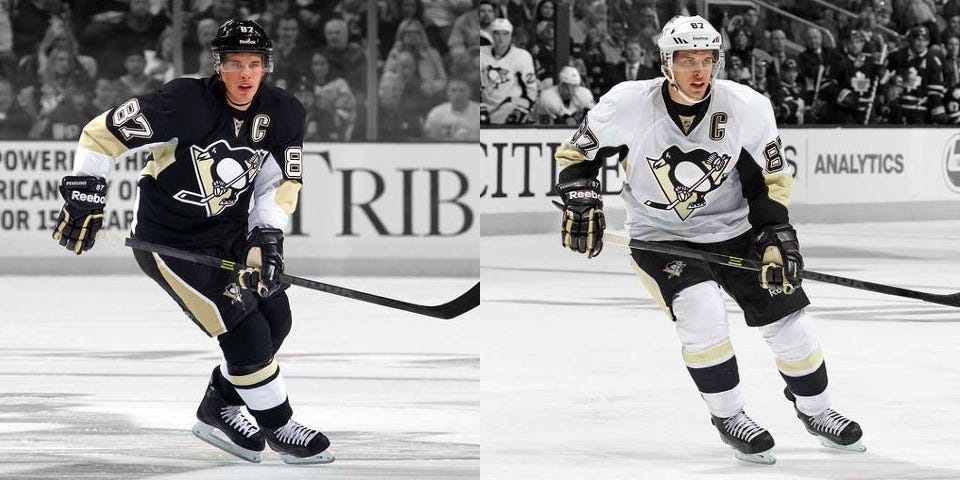
This has nothing to do with my hatred of the Pittsburgh Penguins. It has everything to do with my hatred for that hideous arm template that Reebok came up with. It’s just an awful look all around and the Vegas Gold is a shitty color. I’ll admit that the Penguins’ third jersey is one of the best in the league, but until they fully transition back to those colors, they will have one of the most unis in all of hockey.
22. Vancouver Canucks
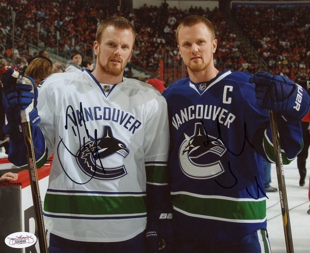
There’s a lot of potential for the Canucks. It was smart of them to go back to the blue and green from the team’s first decade in the league. But something about the big “Vancouver” going across the chest sucks. Just go with the logo and leave it as that. The fewer words on a hockey jersey, the better.
21. Florida Panthers
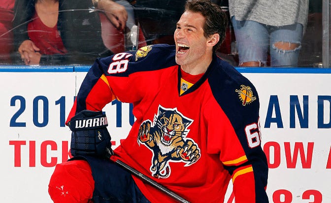
There’s always so much going on with the Panthers’ jerseys. I appreciate their efforts and I’d never expect a team from Sunrise, Florida to have a traditional looking sweater, but it’s just a tough sell. Jagr can wear anything though and look great.
20. Minnesota Wild
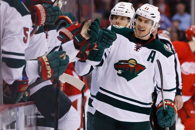
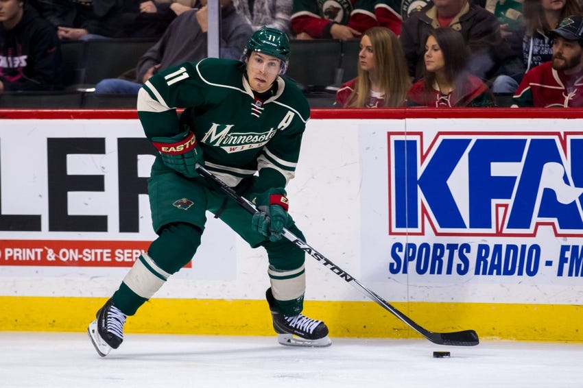
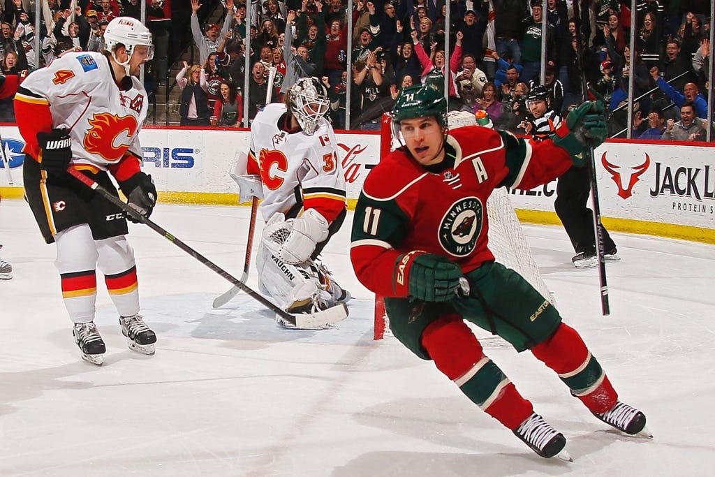
Three different uniforms. Absolutely zero consistency through any of them. The Wild are just lucky they have a great colorway to go off of here so it kind of works. But still, clean it up a little.
19. New Jersey Devils
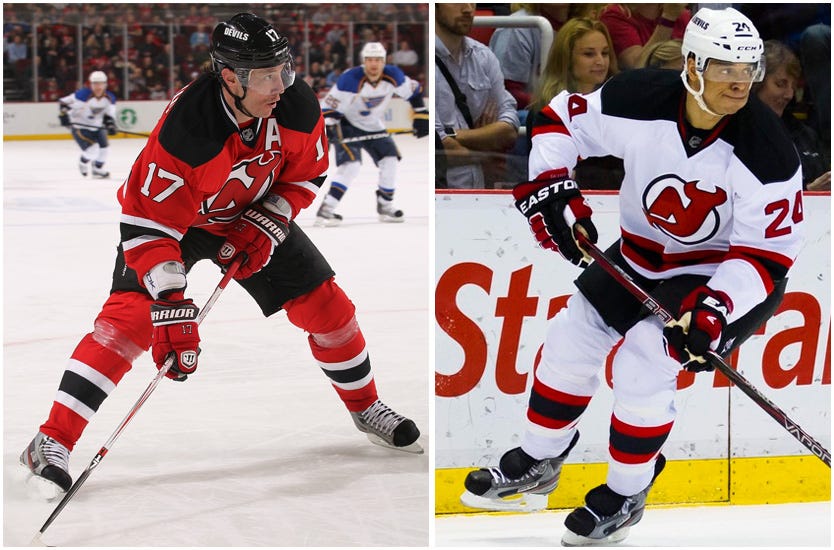
I don’t really have anything against the Devils’ uniforms at all, they just don’t do anything for me. And LOL Kovalchuk.
18. Calgary Flames
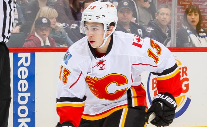

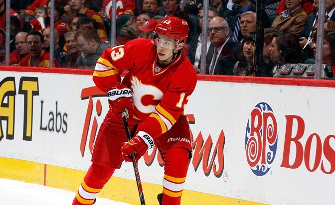
Okay so if the Flames only wore those throwback alternate uniforms, they would be a top 5 for me. But they only wear those every so often so it’s not enough to move them up in the rankings. Also, it’s worth noting that the Flames use 3 different C’s on their jerseys. Not that there’s anything wrong with that, it’s just something to point out.
17. Winnipeg Jets
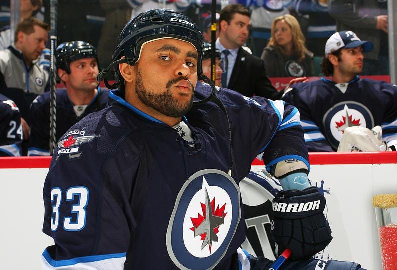
I know everyone in the world was hoping that the Jets would come back looking exactly how they did the first go around, but these Jets aren’t too bad themselves. It’s a pretty easy colorway to work with and everything looks even better with a whiteout.
16. Tampa Bay Lightning

The simplicity works better for the Tampa Bay Lightning more than it does for a lot of teams, but at some point that minimalist approach only gets you so far. It would also be nice to see them go with the white ear loops and straps on their home set up.
15. Los Angeles Kings
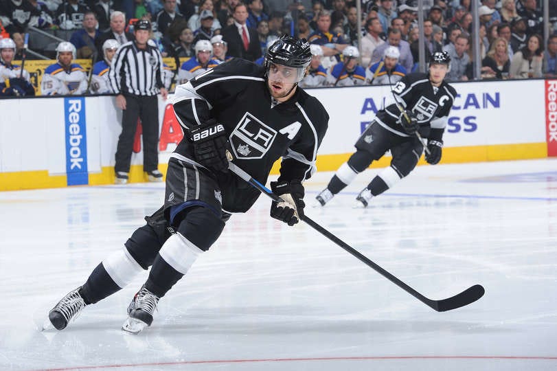
This is where the list starts to get hard. Because I really like the Kings’ set up and I think it works real well for them. I’m a fan of the shield logo but there are just jerseys out there that are better.

Advertisement
14. Carolina Hurricanes
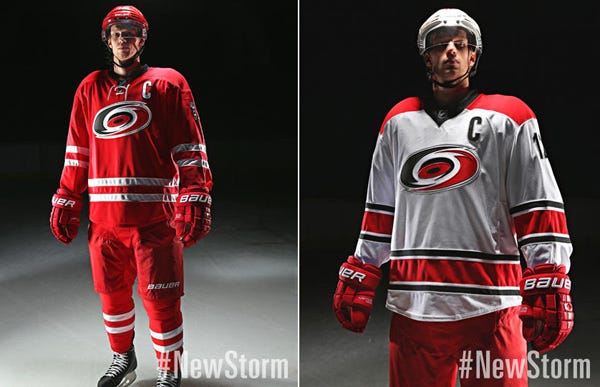
Even though they end up looking like a bunch of candy canes out on the ice, these jerseys are clean. The Hurricanes look about a hundred times better than they play.
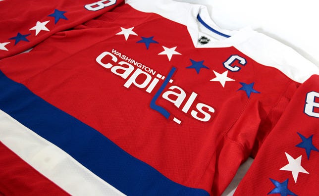
13. Washington Capitals
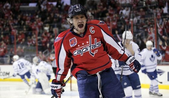
The Caps are another team that benefited from going back to their roots after a complete redesign in the 90s. With that being said, they should keep that movement going even further by making their new third jersey their primary home uniform and their jersey from the WC a few years ago their primary away.
12. Edmonton Oilers
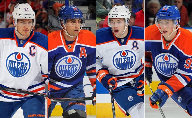
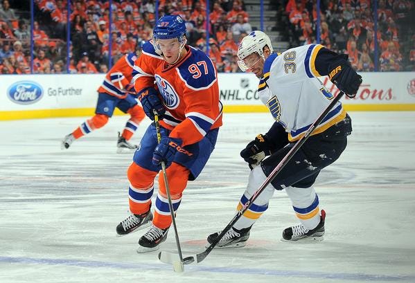
These are some sharp uniforms. But as I’ve said before, I still don’t know what to make of their new third jersey. The numbers on the shoulders just don’t work for me. Everything else, however, does.
11. Buffalo Sabres

Thank god the Sabres rid themselves of the Buffaslug logo. I know I said that I’m not a huge proponent of putting numbers on the front of the jersey but for the Sabres, there’s enough going on that it’s not the most noticeable part of the sweater. Also, I think they’re one of the few teams that have a better away jersey than home.
10. Arizona Coyotes
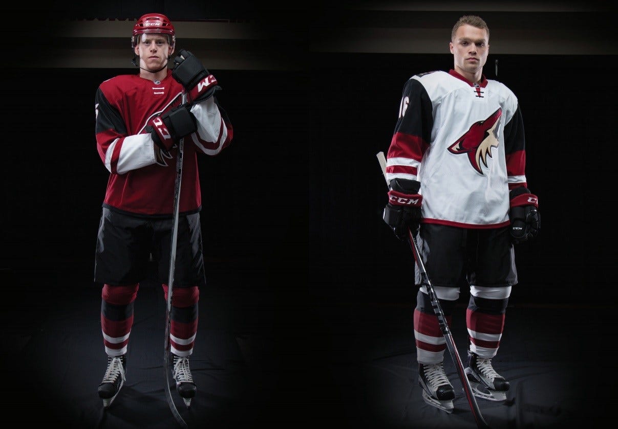

I’m a really big fan of what the Coyotes have done this past summer. They took what was one of the worst sweaters in the league and upgraded themselves to a top 10. It’s unlike any other jersey in the NHL and hopefully they stick around in Arizona instead of having to change again any time soon.
9. Philadelphia Flyers
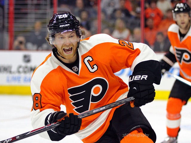
Going back to the original jersey template was the best thing the Flyers could have done after how god awful they looked with the Reebok Edge design. They could have suffered the same fate as teams like the Penguins and just stuck with it, but they slowly weened themselves out of that phase and have one of the best in the league outside of the Original 6. Hopefully they just never decide to bring back the Cooperalls.
8. Tornoto Maple Leafs

A classic jersey that will hold up as long as time. The Leafs went through a few years where they got rid of the stripes at the bottom of the sweater, but they’re back now and aside from maybe tweaking up the socks a bit, there’s nothing I’d change about these uniforms.
7. New York Islanders

So here’s the thing. There’s not a single team in the NHL that is worse at third jerseys than the New York Islanders. They’ve had 5 in the organization’s history and all but 1 of them have completely sucked. The only one that didn’t suck? Well it’s the primary home jersey they wear now. The Islanders making the switch back to royal blue after those years in navy is the best decision they’ve ever made. Like a million times better than their decision to move to Brooklyn.
6. St. Louis Blues
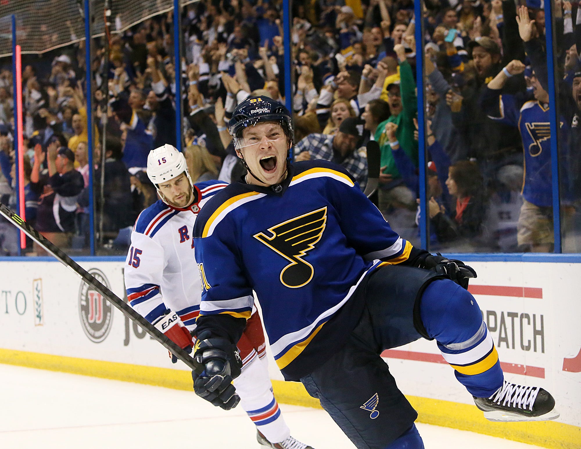
Remember all the way back up at #29 when I talked about how ashamed the Avalanche should be of themselves for keeping the piping on their jerseys? Well the St. Louis Blues are a success story of how a team can get rid of that atrocious look and clean themselves up into one of the best looking teams in the league after switching to these beauties last season.
5. Detroit Red Wings
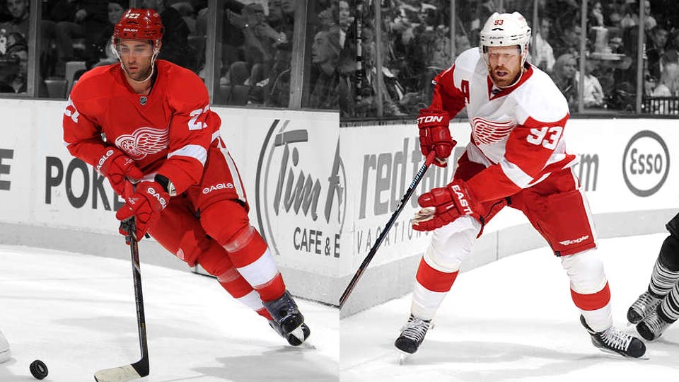
The only thing that bothers me about the Red Wings’ uniforms is that with the new jersey templates, they had to move the captain letters over to the right shoulder. I mean, it’s a unique look now and something that only they have going on, but it messes up my sense of order in the world. Other than that, they’re perfect jerseys.
4. Boston Bruins

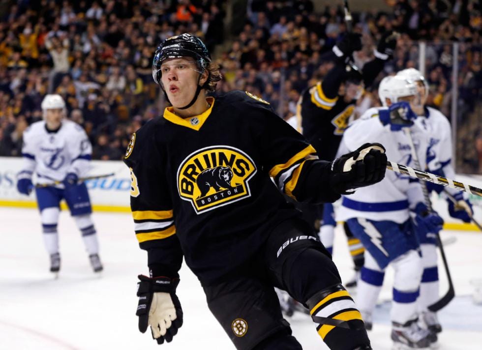
It’s not very often that an Original 6 team can come up with a completely different sweater and it looks better than their standard home and aways, but that’s what the B’s did with this third jersey. The Bruins are one of those teams that can be playing against anybody and it’ll always be a great jersey match up just because they carry the load.
3. New York Rangers
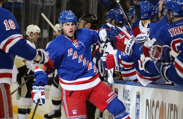
Come to think of it, I really just want to kick the Avalanches’ ass for trying to steal the Rangers diagonal look. Again, a jersey as old as time that should never ever change. Red, white and blue. I may hate the team that wears them, but there’s no denying these sweaters are fantastic.
Advertisement
2. Chicago Blackhawks

I’m so sick of the Blackhawks because of how much success they’ve had lately so I’m not going to say too much here. But the Blackhawks first brought this look to the ice in the 1955-56 season. I wouldn’t change it until the 2955-56 season.
1. Montreal Canadiens

The Montreal Canadiens have always had and will always have the best sweaters in the game. However, this year they decided to show off a little bit and made their home jerseys even better by going with just a white collar and adding the laces to the neck. I dare Adidas to try to get the Canadiens to change anything with their uniforms. Unless it’s just the logo on the back of the neck, they’ll be told to fuck right the hell off.