
The Miami Marlins Ditch Their Terrible Logo And Uniforms For These Awesome Threads

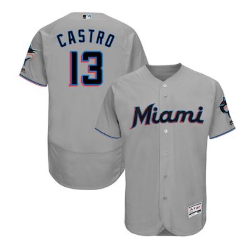

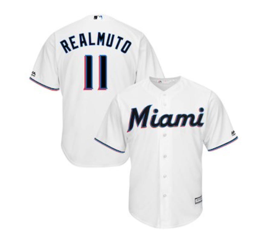
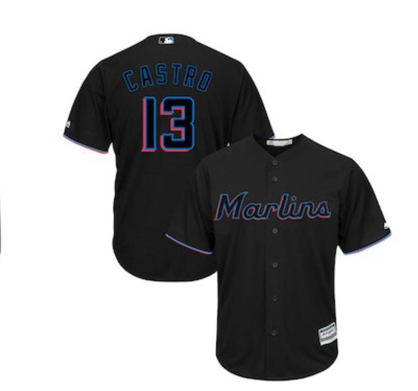
Is this happening? Is Derek Jeter making MORE moves to make the Marlins look like an actual franchise? First getting rid of "Homer" the statue and putting club like seating there, singing the Mesa brothers, and now changing that god awful logo and color scheme and giving them these jerseys? This is a change the club has needed since they moved into their new stadium, the old uniforms, WACK. The cheesy statue, WACK. No one going to their games, WACK. Trading away all their players, WACK. Maybe Jeter isn't the worst owner in sports. These jerseys are fire and I love it. The blue is awesome, think it'll look real good on the field. The black and gray ones are really good looking too, and the white is classic. I think this was a reallllly good job by the Marlins coming up with this new scheme and uniform set. They didn't make it too flashy and still kept it classy looking.
I'm a big fan of this logo. The baseball incorporated into it is a nice touch, and I love that they are bringing that blue back. You can see "Miami" is outlined in just a hint of pink, that's not a bad look. You get a little hint of the old Marlins logo, while still using new colors and having its own identity. A big improvement. it is kind of weird that the "M" is a different font than the rest of the word, but oh well. It's much better logo than previously, but not as good as the original.
I like the look of the hat. The logo sticks out, but it isn't too big and obnoxious. I hope we see a blue alternate hat to go with their blue jerseys as well. The whole new scheme is AWESOME. This SCREAMS Miami, and I love it. I know one guy who isn't a fan of them ditching the orange, but that's okay, he'll survive. The old jerseys were just bad. The orange was gross, it didn't fit with the team, especially after the sick uniforms they had when they were winning World Series.
Absolutely awesome unis right there, the hats were awesome, the teal was the best (have a signed Gary Sheffield teal jersey in my basement, it's not a big deal), I loved this look, and I'm a big fan of the new one too. The new unis and color schemes have to be in connection with the Miami Heat uniforms that look similar. Got that Miami Vice look to it.
I mean just look at their old threads. The logo looks like it was made on MS Paint with a fish thrown above it. They could have done so much, and they didn't. They're just gross. Good riddance.
These stink to high hell!
PS. Someone on reddit said it looked like the Marlin was pissing red in their new logo and now I can't unsee it.