Nobody Likes The Clippers New Logo Or Jerseys

Yahoo - The unofficial designs for the Los Angeles Clippers‘ new logos and uniforms have been out there in the Internet ether and making the rounds since Paul Lukas of UniWatch published leaked graphics in April. We didn’t write anything about those leaks in part because we were kind of hoping that what dribbled out through Lukas’ sources was an early proposal or prototype rather than the real deal, but … well, owner Steve Ballmer removed all doubt with his appearance on “Conan” on Wednesday night:
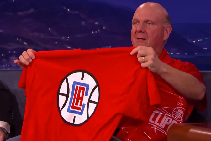
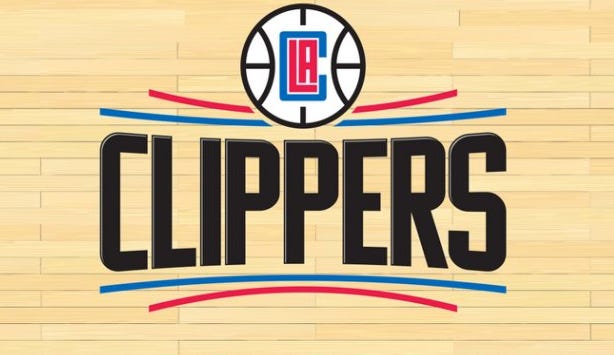
There has not been one positive reaction to the Clippers new logo or jerseys. Not a one. The LAC in the basketball looks like an MS Paint job. The red and blue curved lines are atrocious. But I do sort of like the red jersey. The block letters could definitely be worse.

Really though, the white jersey fucking sucks. The font, the lines, everything. I don’t hate the red one, it’s been getting crushed too, but I don’t think it’s nearly as bad.
But back to the logo itself, it’s an F. The general reaction has been
But Ballmer gonna Ballmer, and he’s still the man. If I was rich as fuck I’d make the logo however the fuck I wanted too. Haters gonna hate, but they can hate while I have billions of dollars in my pockets.